Choosing a Type Scale for a Website, which ratio fits best?
16px for body text. 24px for a heading. Maybe 40px for the page title.
Each size might look perfectly fine on its own. But put them together, and an interesting question appears: do these font sizes actually belong together, or are we just picking numbers that look good?
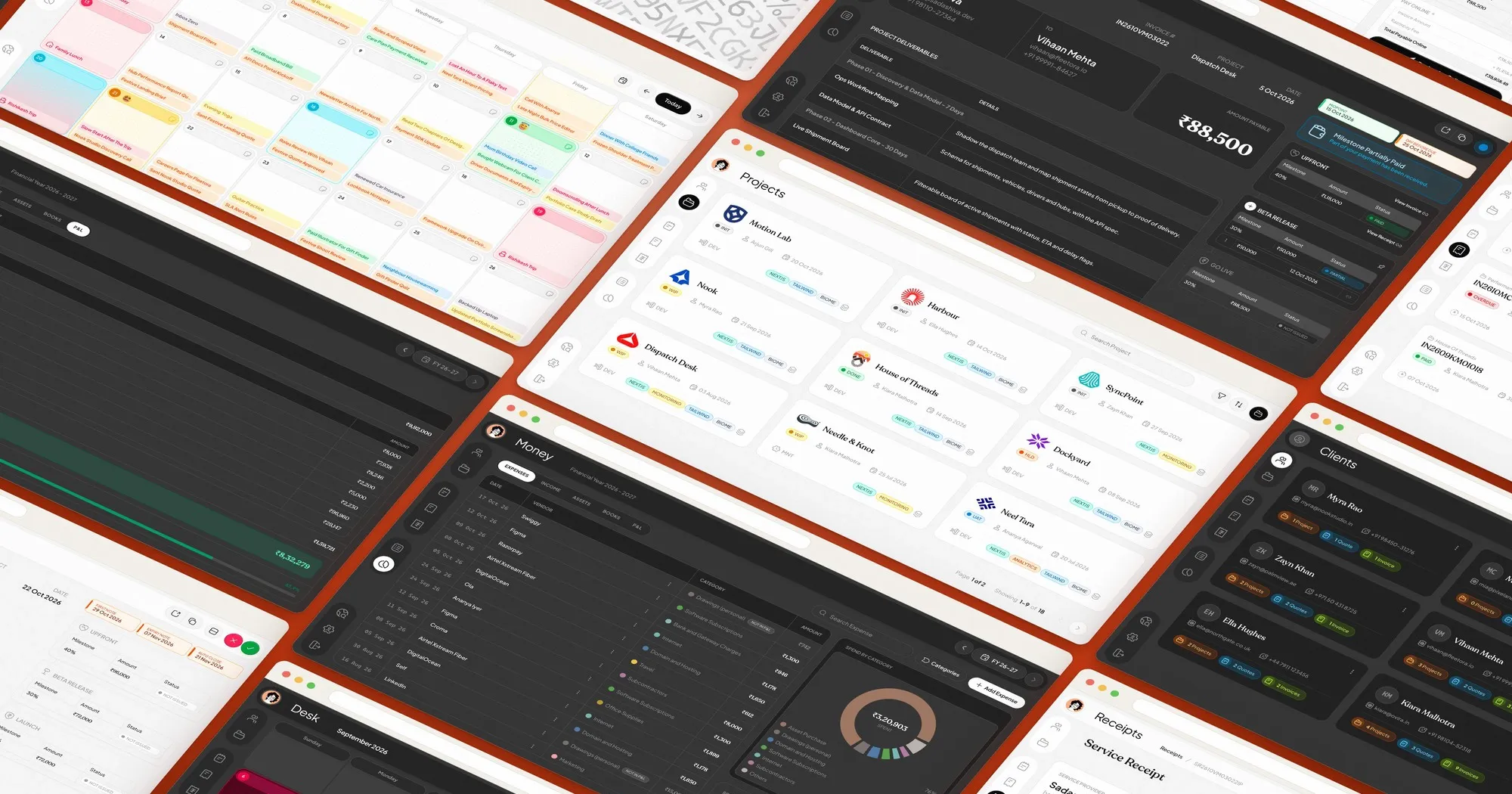
While working on my website and WorkDesk, I explored a more systematic way of making these decisions. That's how I started experimenting with typographic scales, and eventually chose the Major Second (1.125) as my starting point.
Here's what I found useful, how different ratios behave, and why I don't always follow the numbers exactly.
Meet the type scale
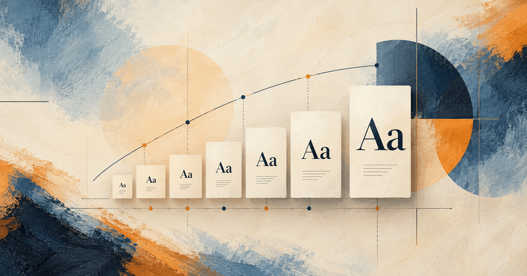
A type scale is simply a sequence of font sizes connected by a mathematical ratio.
You choose a starting size, usually your body text, and multiply it by the same number to create the next size.
For example, let's start with 16px and a ratio of 1.125:
16px → 18px → 20.25px → 22.78px → 25.63px → 28.83px → 32.44px
Each size is 12.5% larger than the previous one. Nothing random, nothing complicated.
That's the Major Second scale. Its name comes from a musical interval, but you don't need to understand music theory to use it.
What I like about this approach is that it gives every size a relationship with the others. You can use the values directly, round them, skip a step, or adjust a size when the design calls for it.
The scale gives you a starting point instead of another collection of guesses.
Change the ratio, change the whole hierarchy
Here's where type scales become interesting.
Keep the body text at 16px, but experiment with different ratios. Look at what happens six steps above the base:
- Major Second (1.125): 32.44px. Gentle, compact, and restrained. Worth trying for dashboards, dense applications, and understated websites.
- Minor Third (1.200): 47.78px. More noticeable contrast. A useful starting point for blogs and content-focused websites.
- Major Third (1.250): 61.04px. Bigger, bolder headings. Worth exploring for landing pages and marketing websites.
- Perfect Fourth (1.333): 89.74px. Dramatic contrast that can suit expressive editorial or portfolio layouts.
- Golden Ratio (1.618): 286.99px. An enormous jump at the sixth step! Better explored selectively for display typography than applied to every heading level.
All five start with the same 16px body text. The only difference is the multiplier.
And that's the interesting part, a tiny change in the ratio can create a completely different visual hierarchy.
Of course, you don't have to use six steps. You might use only three or four, especially with a larger ratio. A scale is a collection of possibilities, not a requirement to use every generated size.
Why I settled on 1.125
After exploring different ratios, I preferred the quieter progression of the Major Second.
I didn't want every heading to demand attention simply because it was much larger than the text around it. I wanted a hierarchy that felt connected, with enough flexibility to distinguish different kinds of content.
I used that approach in two slightly different ways.
WorkDesk: Stay closer to the numbers
For WorkDesk, I followed the 1.125 progression more closely.
The smaller steps gave me a predictable foundation for defining related text sizes. Instead of deciding every value independently, I could work from the scale and assign sizes according to the needs of the interface.
My website: Let the design have a say
For kumardeepak.com, I started with the same ratio but made more adjustments.
Why? Because a mathematically correct number doesn't always look right in the actual layout.
Sometimes a heading needs more presence. Sometimes the line wrapping feels awkward. And sometimes the size that looks good on a desktop doesn't feel balanced on a smaller screen.
So I adjusted selected values for visual balance and responsiveness.
I use 1.125 as a foundation, not a rule that every font size must obey.
And that's probably the most useful thing I've taken from experimenting with type scales, consistency matters, but so does knowing when to make an exception.
Try it on your own project
Here's a small experiment worth doing before settling on a ratio.
Open a page you're designing. Choose one section with a heading, a paragraph, and perhaps a card or two. Use real content, especially a heading long enough to wrap onto another line.
Start with 16px body text and try the Typescale Generator.
First, select 1.125. Apply a few generated sizes to your headings and look at the result.
Now switch to 1.200 without changing the body font or layout. Then try 1.250.
Pay attention to a few things. Can you distinguish the headings easily? Does the larger text take up too much space? Does the section still feel balanced? What happens when you narrow the browser window?
You may find that one ratio immediately feels more suitable for your design. Or you may prefer the smaller steps of one scale but want a larger display heading.
Once you've found a useful direction, define a small set of reusable font-size styles instead of generating an unlimited number of values. Test them on mobile, with longer content, and when text is enlarged.
A good scale is a starting point, not a finish line
I started experimenting with type scales to make font-size decisions more consistent. The Major Second (1.125) became my preferred starting point for both my website and WorkDesk, even though I applied it differently in each project.
Would I use it for every website? Probably not.
A bold marketing page might benefit from a larger ratio. A dense application might need smaller differences. And some layouts will benefit from deliberately adjusted values.
What matters is having a reason behind the sizes you choose.
Start with a ratio. See how it feels with real content. Adjust what doesn't work. Keep what does.
The mathematics helps create the relationship. Your design judgment makes that relationship useful.